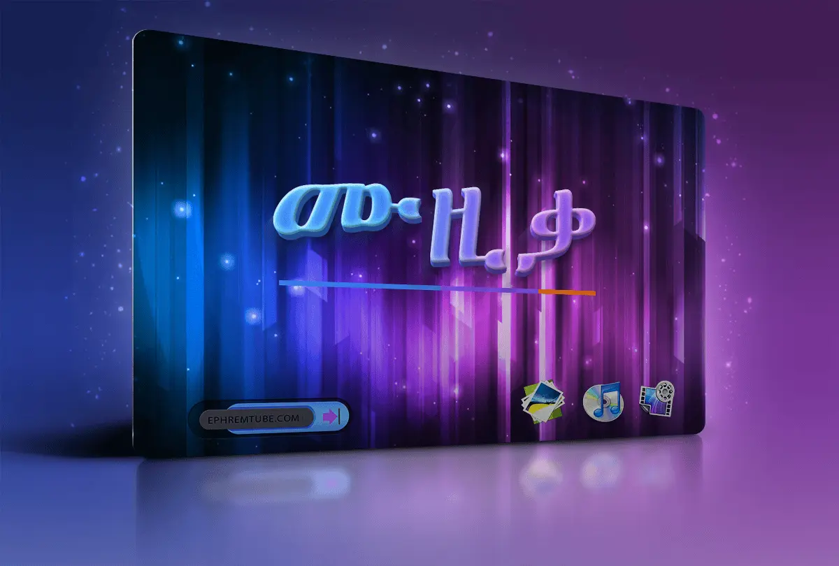
2016 marked a turning point for EPHREMTUBE.COM. With a fresh vision and a focus on user experience, the platform officially became fully responsive—adapting seamlessly across desktops, tablets, and mobile devices.
This transformation was more than just a design upgrade. It was a commitment to accessibility, ensuring that visitors could engage with content anytime, anywhere, without limitations. Whether on a large screen or a smartphone, the experience is now smoother, faster, and more intuitive.
EPHREMTUBE.COM continues to evolve, but 2016 will always stand as the year it embraced the future of the web.